
Most streaming apps look alike: a black screen, bright posters and a player that hides in the dark. That template was built for thrillers.
It is the wrong room for someone who opens an app in the morning to listen to an aarti.
Bhaktidwar TV is a devotional streaming service: bhajans and aartis, spiritual films, discourses and short devotional videos, for an audience of more than 100k YouTube subscribers. Apexnova built the Android, iOS and web apps and the backend they run on. This is the story of a streaming app that does not look or behave like every other one, and the engineering a different look quietly demands.
A streaming app that feels like a quiet room
The audience for devotional content is broad. It includes people who use few other apps, families watching together on a tablet, and people who simply want a calm few minutes in a busy day. For all of them the app has to feel welcoming before it feels clever.
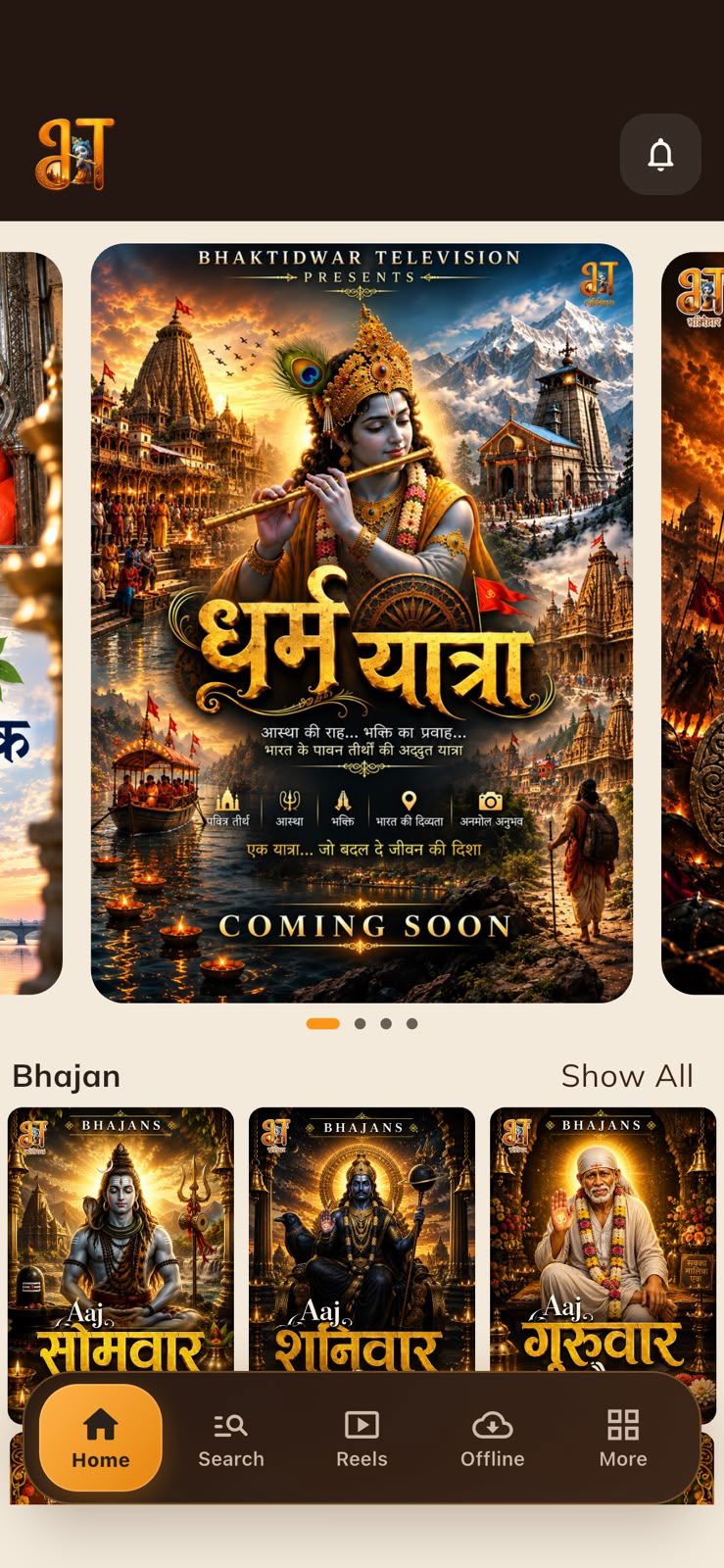
A visual identity of its own. Warm and light, drawn from the colours of the subject, not borrowed from entertainment apps.
Nothing to learn. Five clear destinations: Home, Search, Reels, Offline and More.
Sandalwood and saffron, built once
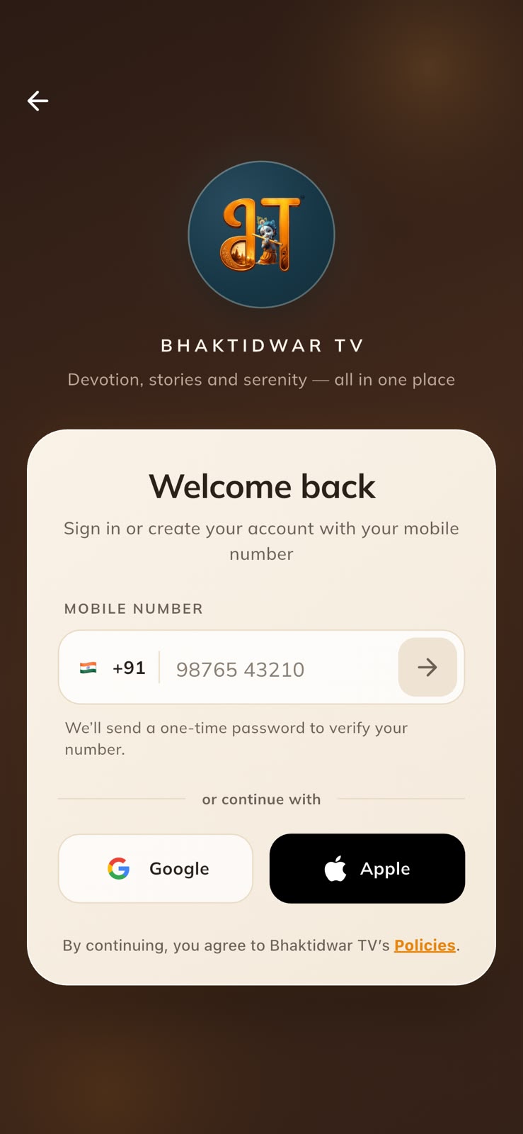
The app is built on a sandalwood palette: a warm, pale background, slightly deeper tones for cards and dividers, and saffron for anything the viewer can act on. The sign-in flow is the one place that goes dark, a deep temple-wood gradient with a soft saffron glow, so opening the app feels like stepping inside.
A palette is easy to pick and hard to keep.
A streaming app has dozens of screens, and the usual result is that each one drifts. Here the shared pieces were built once and reused.
One set of detail-page parts. The film, series and episode pages differ only in what they list under the player, so the app bar, player frame, title block, buttons and section headers exist once and are styled once.
One set of panel parts. Profile, contact and settings screens are all stacks of labelled cards, built from the same components.
One sign-in frame. The login screen and the code-verification screen share their chrome, so the two steps read as one continuous flow.
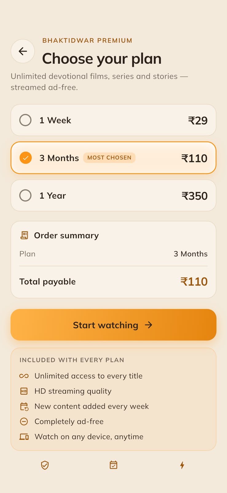
Icons, never emoji. Emoji look different on every phone. An icon looks the same everywhere, including on the subscription page.
Loading states that stay visible. Shimmering placeholders are designed for dark apps and vanish on a pale background. They were darkened within the same hue, so a loading screen still reads as one.
The player controls nobody could see
This is the kind of problem a light theme creates that nobody plans for.
Video player controls are white: white play button, white seek bar, white timestamps. That works because players normally sit on black. Bhaktidwar TV plays video inline on its pale detail pages, where white controls wash out, and over a bright frame they disappear entirely.
The controls were redrawn in black, with a light scrim behind them.
The scrim is what makes it work in both directions: the controls stay readable against the page, and they stay readable when the video itself goes dark.
Tablets, without giant posters
Devotional content is often watched on a larger screen, propped up and shared. The first layout sized every poster as a share of the screen width, the standard approach. On a phone, fine. On a tablet, a poster came out three times its phone size, and a single carousel item could fill the whole screen.
The fix was a change of principle.
A poster should be about the same physical size on any device. A bigger screen should show more of them, not bigger ones.
Rows show more tiles. Tiles are anchored to their phone size and allowed to grow only slightly on a tablet, which sits further from the eye.
Grids add columns. Never fewer than the phone layout, and enough that a poster stays near its natural size.
No jumps on foldables. The rule applies at every width, so a tile grows smoothly as a foldable opens instead of snapping at a breakpoint.
The carousel answers to height. A tall poster sized from a tablet's width is taller than the screen and pushes everything else out of view. Its height is capped to what is left under the app bar, and the width follows.
Lone banners become spotlight cards. A single wide banner looks lost on a tablet. There it becomes a full-width card with the artwork on one side and the title, genres and synopsis beside it, using room the phone layout does not have.
The phone layout was left exactly as it was. All of this only takes effect once the window is larger than a phone.
Reels, offline and what's coming next
Reels. Short devotional videos have their own tab: a full-screen vertical feed for the moments when there is no time for a full film or discourse.
Offline as a main tab. Films and episodes can be downloaded and watched without a connection, from a tab of their own, not a setting buried in a menu. Downloads show progress and can be paused, resumed or cancelled, and saved titles open in a dedicated offline player.
Upcoming, at a glance. Each upcoming title carries a small tear-off calendar block with the month, the day and a count of the days remaining.
Picking up where you left off. Episode lists show a resume bar on anything partly watched.
A home screen that follows the calendar
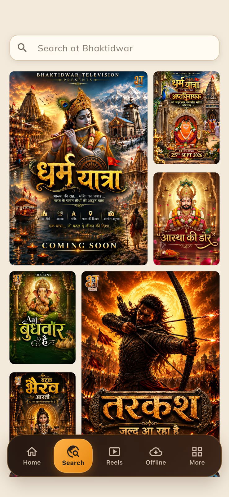
The home screen is not fixed in the app. The backend Apexnova built sends an ordered list of sections, and each one names its shape and size: a slider, a row of posters, wide banners, large or small variants. The app draws what it receives.
A festival one week, a new series the next, with no app update in between.
Each row also has a "show all" page with the complete collection behind it. The subscription page follows the same idea: plans are compact rows, so any number of them stays easy to compare, with quiet reassurance beneath the button and no clutter around it.
One codebase, every screen
Bhaktidwar TV is written in Flutter. The Android app, the iOS app and the website share one codebase and one backend, and the web version has its own video player and home layout where a browser calls for it.
Combined with the layout rules above, that one codebase covers phones, tablets, foldables and desktop browsers, and a design change made once shows up on all of them.
 WatchStar